The Data Dashboard is an interactive tool to help better understand the impacts of the November 2021 Red Hill fuel spill. The dashboard enables various spatial analyses through the addition of pertinent geospatial information.
Click on the different tabs at the bottom of the dashboard. The first tab, “Tap Water Screening,” shows screening results of potential fuel contamination in community tap water samples using fluorescence spectroscopy and displays the screening results with additional interactive features, including temporal trends. The second tab, “Impacted Schools”, can be used to understand the number of potentially impacted students and schools following the November 2021 fuel spill. The third tab, “Social Vulnerability Indicators”, helps visualize some of the most vulnerable populations in the area. Additional data will be added to the dashboard as it becomes available.
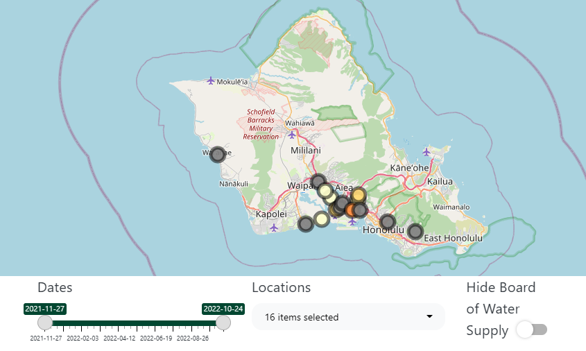
The Tap Water Screening Dashboard provides an interactive visualization tool to analyze spatial and temporal patterns of potential fuel contamination in tap water samples collected from December 2021 to the present. Tap water samples were collected from surrounding areas impacted by the Red Hill fuel spill. Sample collection is conducted through water screening requests.
Data presented on this Dashboard were not generated using certified methods approved by the Environmental Protection Agency (EPA) and are not equivalent to data generated by the Navy and the Hawaiʻi Department of Health (DOH). They are not intended for assessing health risks. For answers to frequently asked questions about this dashboard, click here.
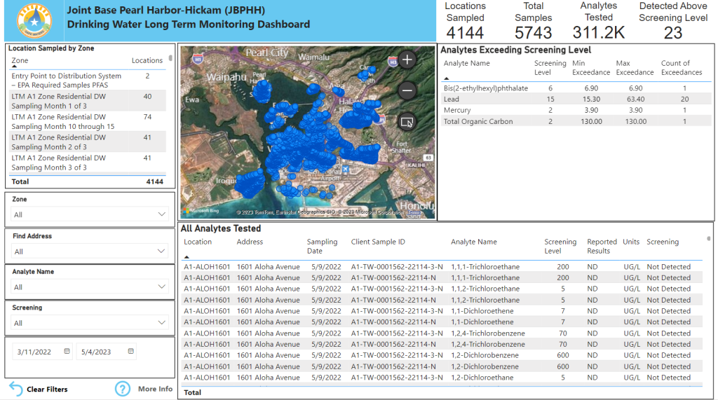
The Joint Base Pearl Harbor-Hickam Drinking Water Long-Term Monitoring Dashboard collects military household drinking water samples from various zones impacted by the Red Hill fuel spill. The dashboard contains data from samples taken from March 2022 to the present.
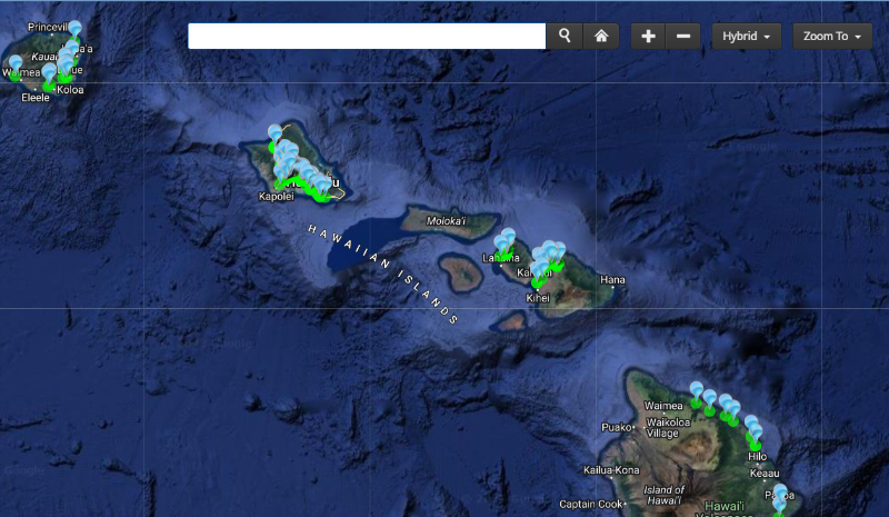
The Hawaiʻi Department of Health Safe Drinking Water Branch Groundwater Contamination Viewer allows users to find contaminated groundwater samples and underground injection control facilities on an interactive map.
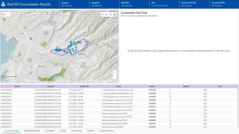
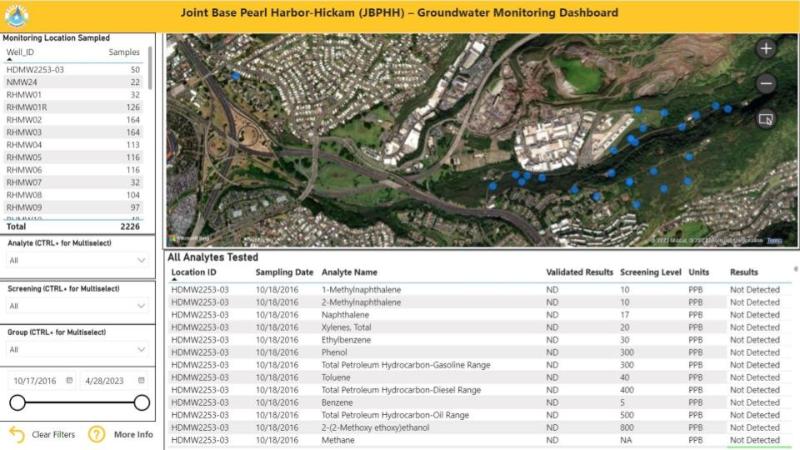
The Joint Base Pearl Harbor-Hickam Groundwater Monitoring Dashboard contains up-to-date groundwater results from monitoring locations surrounding the Red Hill Bulk Fuel Facility dating back to 2016.
Additionally, the latest PFAS soil and groundwater sampling data are available here in response to the November 29, 2022 AFFF concentrate release.
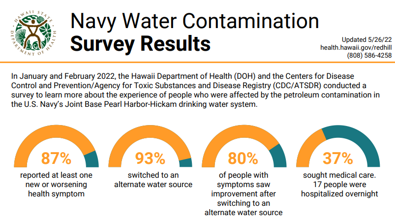
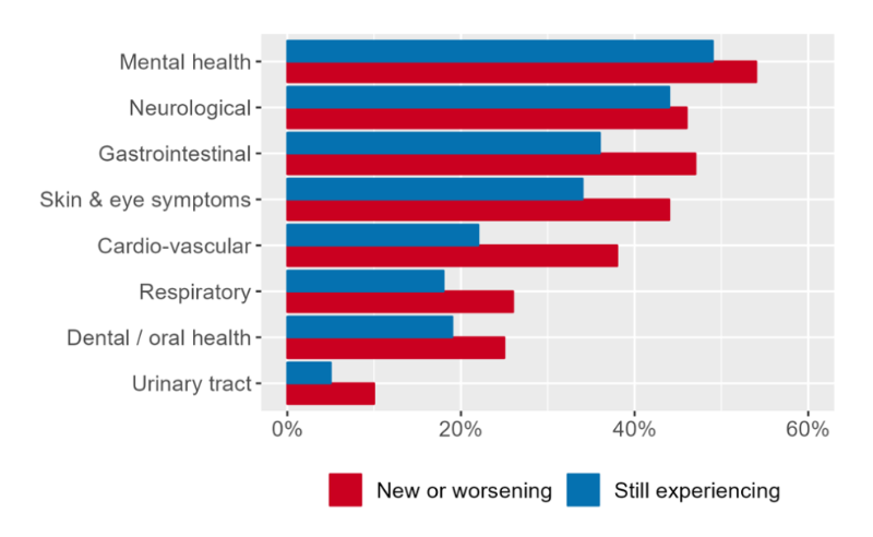
Results from surveys conducted by the State of Hawaiʻi Department of Health and the Centers for Disease Control and Prevention/Agency for Toxic Substances and Disease Registry in February 2022 and September 2022 to learn about the experiences of people affected by petroleum contamination in the U.S. Navy’s Joint Base Pearl Harbor-Hickam drinking water system. Please review the links below for the results.
Part 2: Navy Water Contamination Follow-Up Survey Results, Oʻahu, Hawaiʻi, September 2022
In response to the Centers for Disease Control surveys, UHERO, WRRC, and the Department of Geography and Environment at UH Mānoa conducted a follow-up survey of previous survey respondents in July 2023 to better understand on-going physical and mental health symptoms, household well-being impacts, satisfaction with response to the crisis, and trust in institutions.
